MoveYourBody.com Redesign
MoveYourBody.com is a tour-booking website that promotes mastering a sport on a trip. The web aims to connect tourists and curators, to promote a new lifestyle and support local sports businesses. I independently led this redesign during my first year of graduate study, helping the owner validate the concept and attract investment.
Why Redesign?
Low retention rate + untrustworthy branding = Unprofitable
Video shown above is the original website.
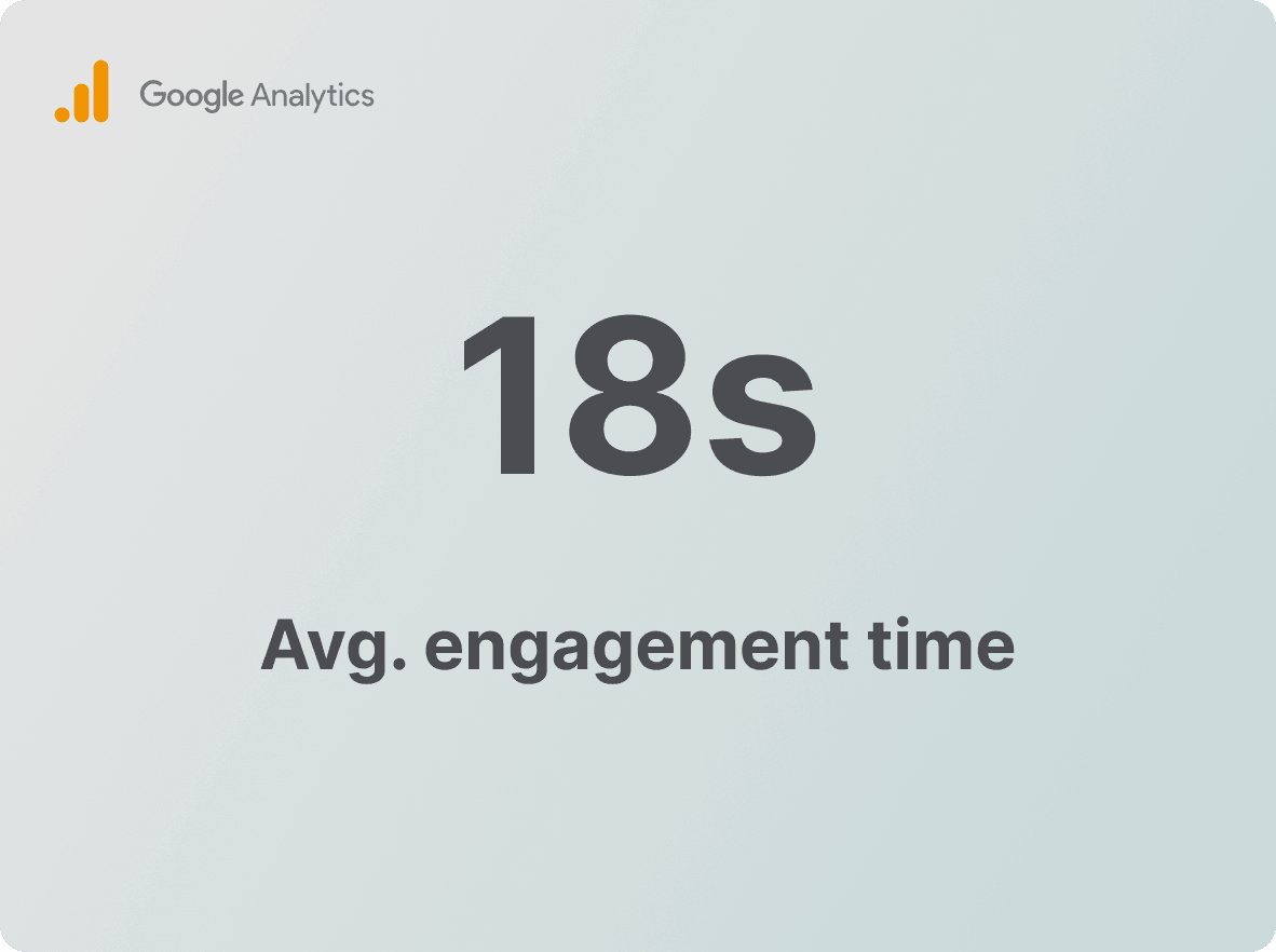
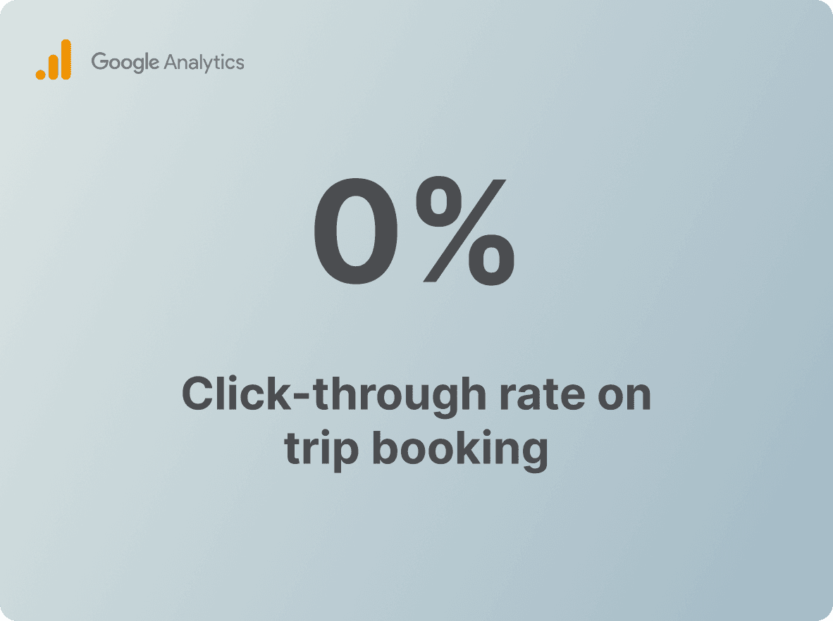
The owner came to me with a problem: users were spending less than 20 seconds on his website. After uncovering that the business goal was to have users book trips, I quickly realized that the low retention rate posed a serious problem, likely leading to a low click-through rate and an unprofitable business model.
Research To Uncover What Caused The Low Retention Rate
The site fails to communicate its purpose, causing users to overlook the unique selling point of combining sport and travel.
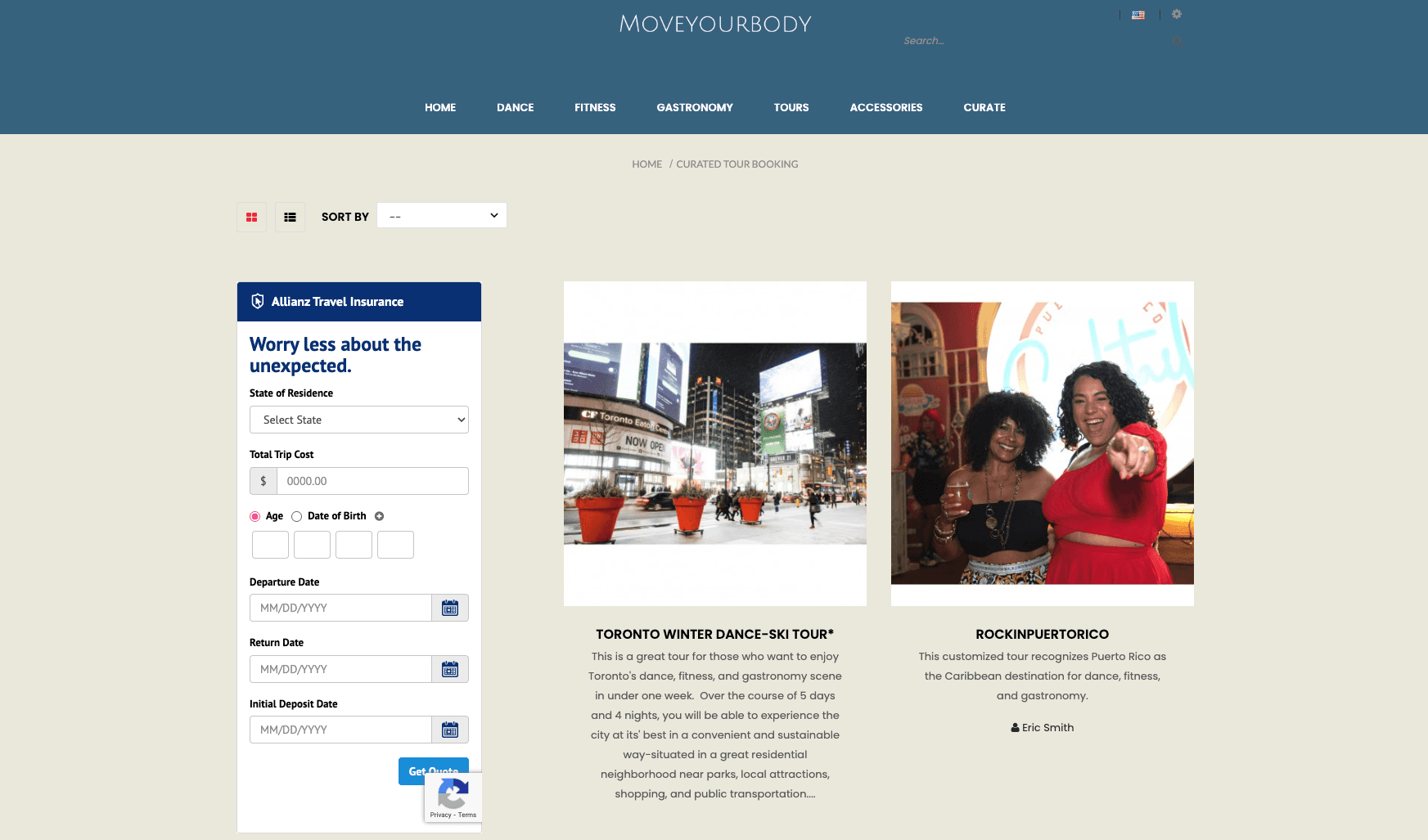
The site gives off an untrustworthy vibe. Lack of trust makes users hesitate to take actions.
Design Phase 1
Reshape the design system
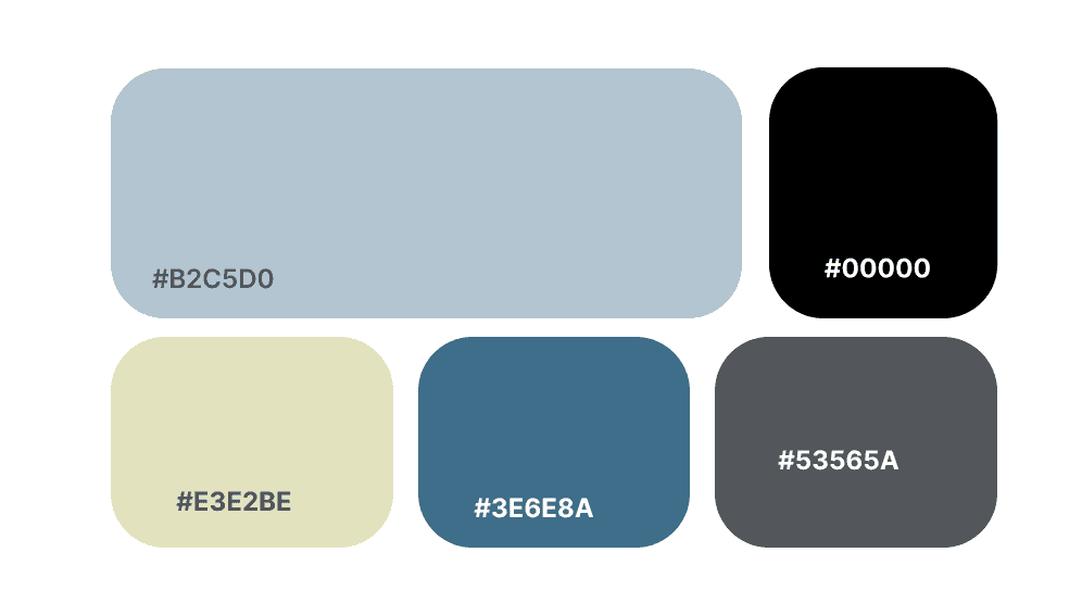
To create a scalable system, I replaced the primary theme color (#3E6E8A •) with a softer, cloudy blue (#B2C5D0 •) optimized for large-scale application. The original theme color was reintroduced as an elevated secondary accent, complemented by a contemporary highlight (#E3E2BE •), to create a more balanced and accessible palette.
Design Phase 2
Reshape the design system
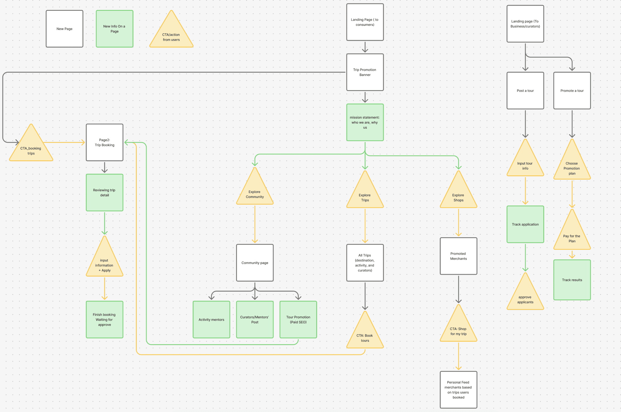
I restructured the information architecture and strengthened calls-to-action across the system. In this process, I unified previously isolated features—such as trips and merchant shopping—into a cohesive flow, while introducing new mechanisms like personalized feeds and promotional placements as additional revenue streams.
Design Phase 3
A final design website
Home Page
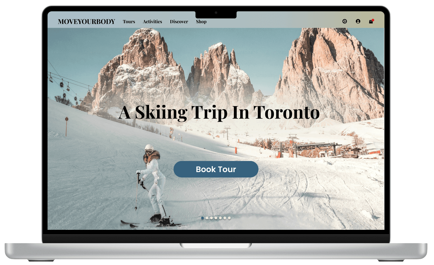
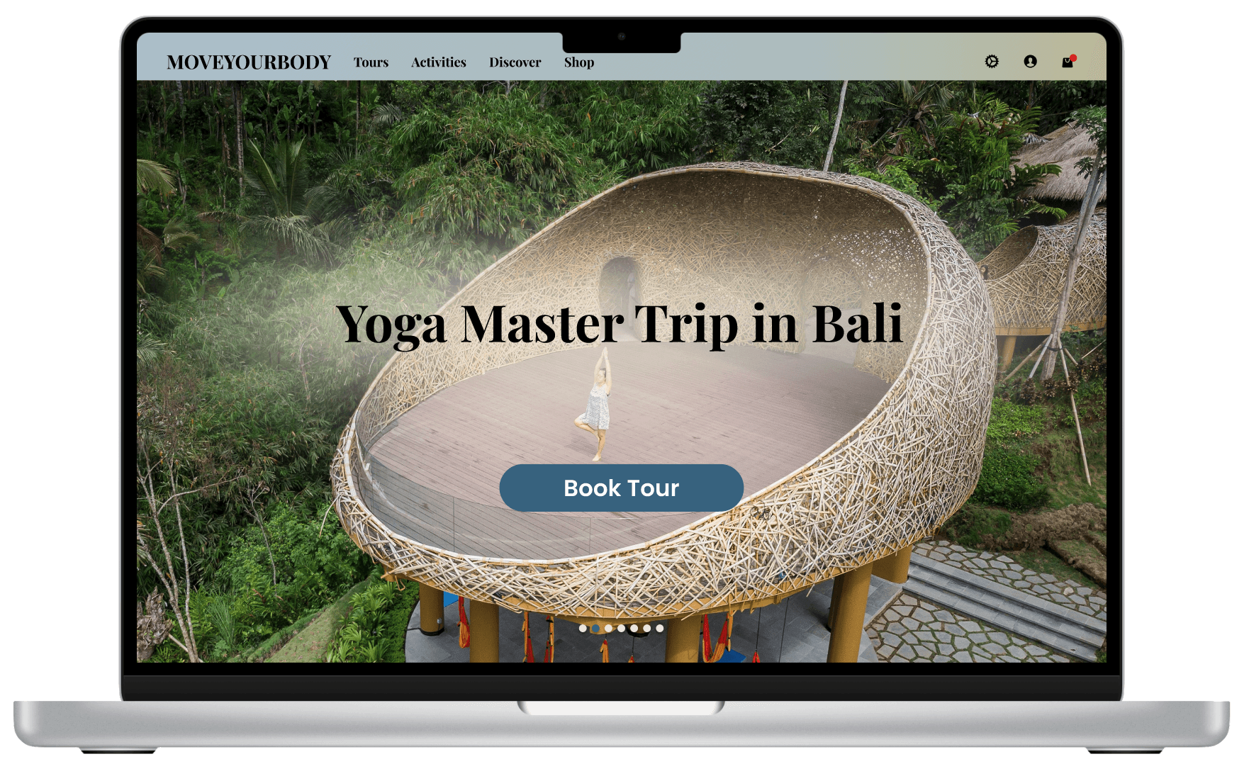
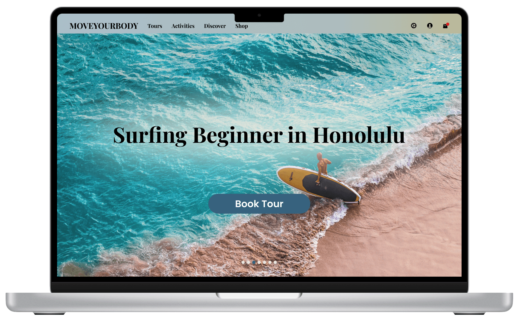
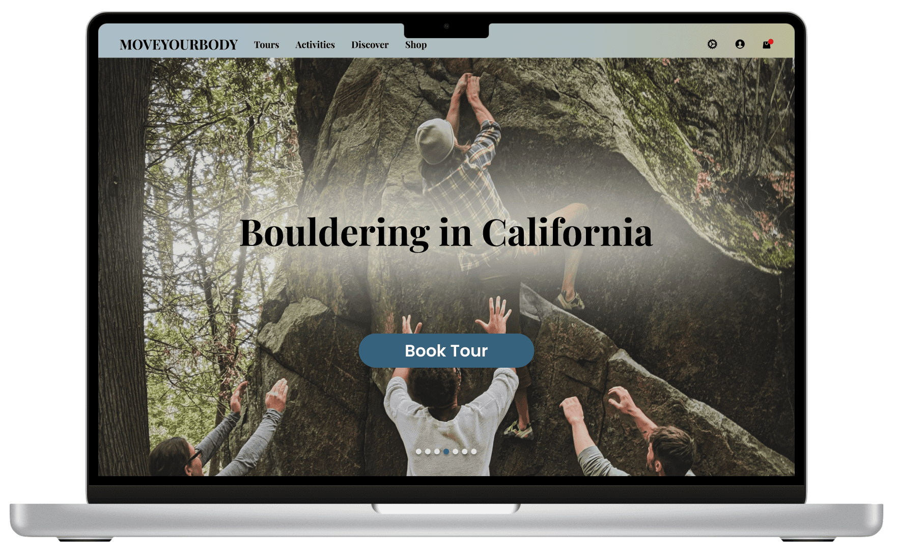
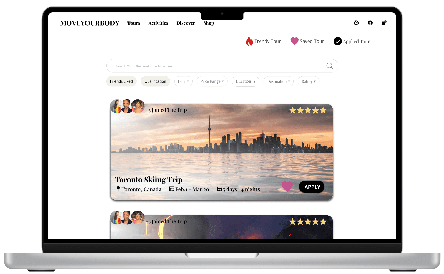
designed to highlight sport-focused trips through imagery that blends activity and nature, emphasizing the uniqueness of the experience. A shuffling display of different trips was introduced to capture diverse user interests, while clear calls-to-action guide visitors toward the core business: booking tours.
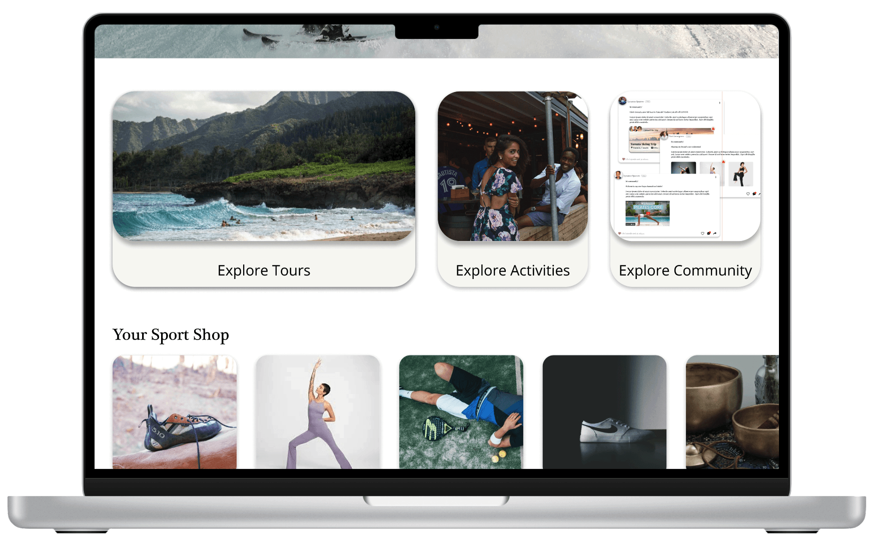
Home page scrolling down - Introduce secondary services as smaller modules to be viewed at once. All the secondary services lead users to the primary feature: booking a sports trip.
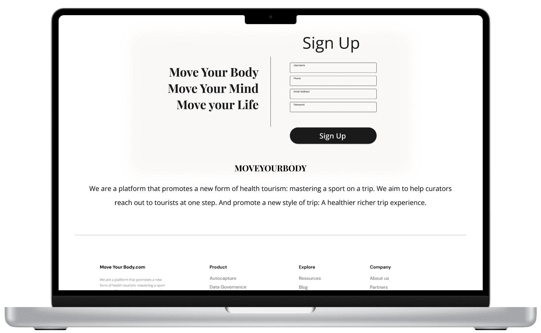
Home page scrolling down - I also condensed the mission statement and moved it down toward the footage and let the users focus on the main features.
Click into a trip - A detailed daily itinerary is displayed to foster a sense of trust and safety. The ‘Apply’ button is placed at both the top and bottom as the sole action, ensuring easy access and reduced decision friction in line with Hick’s Law and Fitts’ Law.
Community Page
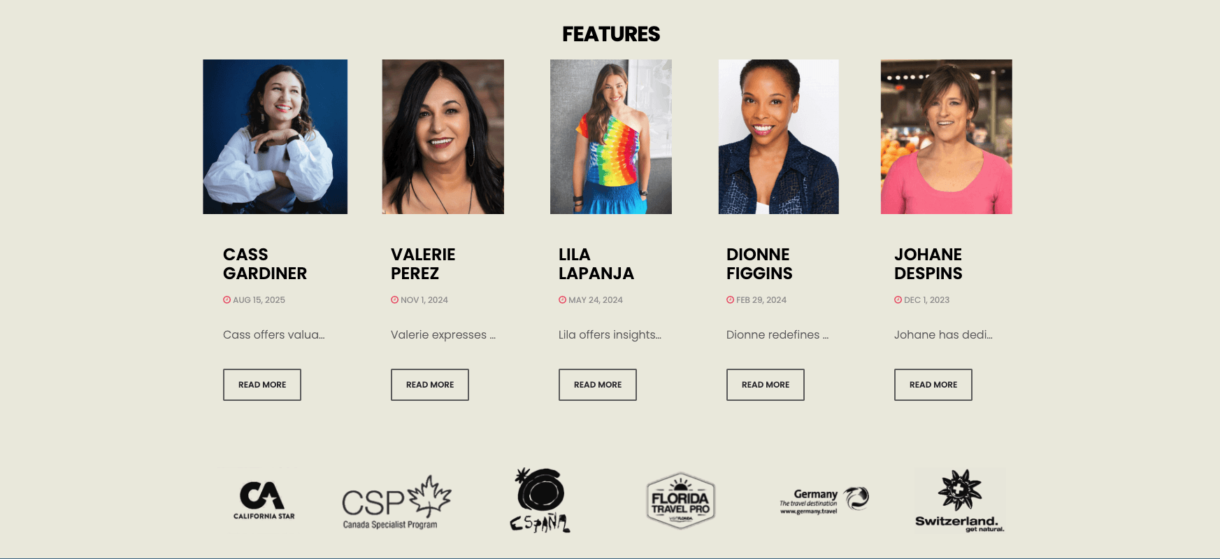
Challenge: The original website featured influencers in the sports-tour field to attract their followers and build the trust of the brand.
However, after interviewing the stakeholders and founders, I discovered that the influencers hadn’t consented to the use of their images. While direct business collaboration is costly, the founder remains eager to engage influencers and gain their support.
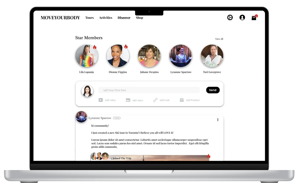
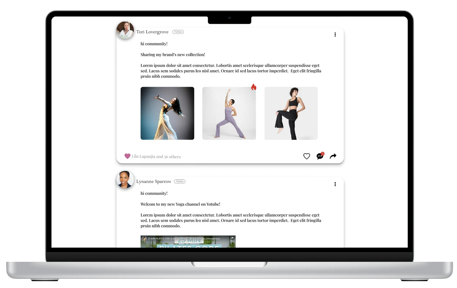
My solution is to move the influencer list to the Discover page, transforming it into a community-driven media platform where tourists, curators, and merchants can share experiences, tours, and content from other media sources. Instead of a "featured celebrity list," there would be a "Star Member" recognition, honoring the members with the most followers on MoveYourBody.
Inviting influencers to join a platform that provides greater exposure and engagement can significantly reduce endorsement costs while still benefiting from the trust and influence these influencers bring.
If the community feature proves effective in boosting tour sales, paid posts, and SEO strategies could be introduced to add a new revenue stream.
Shop Page
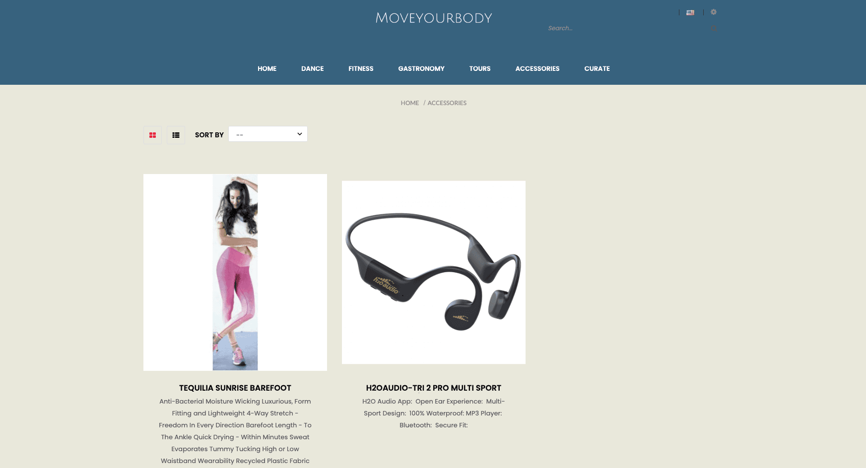
Previously, the shop existed as an isolated feature accessible only through navigation.
The redesign combined the shop with the trip experience.
Once users book or like a trip, they are offered relevant gear and apparel recommendations based on the tour's location and activities. Wear shops offer a profitable opportunity to sell sportswear and trip essentials, enabling the founder to remove banner ads that previously undermined the site’s trustworthiness.
